Customizing WPF combo box style
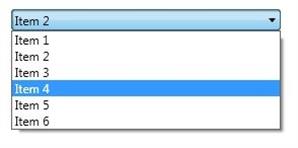
By Mirek on (tags: combobox, CustomTemplate, style, WPF, categories: code)It this post we will try to create a custom combo box style which adjust the look of standard control to our needs.
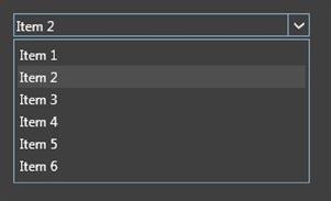
and achieve something like this
Great styling examples for combo box, buttons and tab items can be found on Codeplex, which I based my work on.
If you are not familiar with styling in wpf there is a lot of resources on the internet. I suggest starting on MSDN. For detailed information about changing the look and feel of the standard wpf controls go to Customizing the Appearance of an Existing Control by Creating a ControlTemplate.
As you can see on above picture we are going to change the look of the standard combo box totally. Even the small, right arrow is going to be changed. To achieve that we have to totally replace whole control style. Below I have put the skeleton of the XAML styles
1: <ControlTemplate x:Key="CustomToggleButton" TargetType="ToggleButton">
2: <Grid>
3: <Border Name="Border" />
4: <Border Name="SmallBorder" />
5: <Path Name="Arrow" />
6: </Grid>
7: </ControlTemplate>
8:
9: <Style TargetType="{x:Type ComboBoxItem}">
10: <Setter Property="FrameworkElement.OverridesDefaultStyle" Value="True" />
11: <Setter Property="Control.Template">
12: <Setter.Value>
13: <ControlTemplate TargetType="{x:Type ComboBoxItem}">
14: <Border>
15: <ContentPresenter />
16: </Border>
17: </ControlTemplate>
18: </Setter.Value>
19: </Setter>
20: </Style>
21:
22: <Style TargetType="{x:Type ComboBox}">
23: <Setter Property="FrameworkElement.OverridesDefaultStyle" Value="True" />
24: <Setter Property="Control.Template">
25: <Setter.Value>
26: <ControlTemplate TargetType="ComboBox">
27: <Grid>
28: <ToggleButton Template="{StaticResource CustomToggleButton}" />
29: <ContentPresenter />
30: <TextBox />
31: <Popup>
32: <Grid>
33: <Border>
34: <ScrollViewer>
35: <ItemsPresenter />
36: </ScrollViewer>
37: </Border>
38: </Grid>
39: </Popup>
40: </Grid>
41: </ControlTemplate>
42: </Setter.Value>
43: </Setter>
44: </Style>
For the sake of clarity I have removed all less important setters and attributes. The most important setter, which is
1: <Setter Property="FrameworkElement.OverridesDefaultStyle" Value="True" />
indicates that we are going to totally override the default style. It means that our combo box will not use standard theme style properties, but all style properties will come from styles provided by us. We must override all control styles since we want to change the shape of the arrow and thus change the look of the toggle button of the combo box.
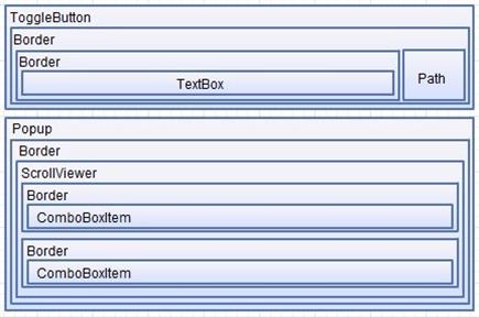
In line 1. starts the control template for the ToggleButton which is the main container for combo box and all controls that can change its state. In our case it consists of two borders, one includes whole content and the second includes the text box only, and the path geometry which draws the arrow.
The ComboBoxItem template contains some triggers which changes the colors of highlighted items. These triggers are not visible here.
In line 22 you can see the style and control template for the combo box itself. It is built on grid and contains ToggleButton, ContentPresenter, TextBox. TextBox here is visible when the combo box is in editable mode.
In the XAML above you can see we create custom control templates for ComboBoxItem, ToggleButton and for whole ComboBox .
The structure of controls that are incorporated is shown below
The Path element is used to draw the arrow which looks as we expect. This is done in ToggleButton control template
1: <ControlTemplate x:Key="CBCustomToggleButton" TargetType="ToggleButton">
2: <Grid>
3: <Border Name="Border"
4: BorderThickness="1,1,1,1"/>
5: <Border Name="SmallBorder"
6: BorderThickness="0,0,1,0" />
7: <Path Name="Arrow"
8: Width="10"
9: Data="M0,0 L0,2 L4,6 L8,2 L8,0 L4,4 z"
10: Fill="{StaticResource ActiveBorderBrush}" />
11: </Grid>
12: <ControlTemplate.Triggers>
13: <Trigger Property="UIElement.IsMouseOver" Value="True">
14: <Setter TargetName="Border" Property="BorderBrush" Value="{StaticResource ActiveBorderBrush}" />
15: <Setter TargetName="SmallBorder" Property="BorderBrush" Value="{StaticResource ActiveBorderBrush}" />
16: <Setter TargetName="Arrow" Property="Fill" Value="White" />
17: </Trigger>
18: <Trigger Property="ToggleButton.IsChecked" Value="True">
19: <Setter TargetName="Border" Property="BorderBrush" Value="{StaticResource ActiveBorderBrush}" />
20: <Setter TargetName="SmallBorder" Property="BorderBrush" Value="{StaticResource ActiveBorderBrush}" />
21: </Trigger>
22: <Trigger Property="UIElement.IsEnabled" Value="False">
23: ...
24: </Trigger>
25: </ControlTemplate.Triggers>
26: </ControlTemplate>
The control template of the ToggleButton and ComboBoxItem are referenced in control template for our custom combo box, embedded in following style, presented in simplified version below
1: <Style TargetType="{x:Type ComboBox}">
2: <Setter Property="Control.Template">
3: <Setter.Value>
4: <ControlTemplate TargetType="ComboBox">
5: <Grid>
6: <ToggleButton Name="ToggleButton"
7: Template="{StaticResource CBCustomToggleButton}" />
8: <ContentPresenter Name="ContentSite"
9: Content="{TemplateBinding ComboBox.SelectionBoxItem}"
10: ContentTemplate="{TemplateBinding ComboBox.SelectionBoxItemTemplate}"/>
11: <TextBox x:Name="PART_EditableTextBox"
12: Foreground="{TemplateBinding Foreground}"
13: IsReadOnly="{TemplateBinding IsReadOnly}"
14: Visibility="Hidden" />
15: <Popup Name="PART_Popup"
16: IsOpen="{TemplateBinding ComboBox.IsDropDownOpen}">
17: <Grid Name="DropDown"
18: MinWidth="{TemplateBinding FrameworkElement.ActualWidth}"
19: MaxHeight="{TemplateBinding ComboBox.MaxDropDownHeight}"
20: SnapsToDevicePixels="True">
21: <Border Name="DropDownBorder"
22: Background="{TemplateBinding ComboBox.Background}">
23: <ScrollViewer Margin="4,6,4,6">
24: <ItemsPresenter KeyboardNavigation.DirectionalNavigation="Contained" />
25: </ScrollViewer>
26: </Border>
27: </Grid>
28: </Popup>
29: </Grid>
30: <ControlTemplate.Triggers>
31: ..
32: <Trigger SourceName="PART_Popup" Property="Window.AllowsTransparency" Value="True">
33: <Setter TargetName="DropDownBorder" Property="FrameworkElement.Margin" Value="0,2,0,0" />
34: </Trigger>
35: <Trigger Property="ComboBox.IsEditable" Value="True">
36: <Setter Property="KeyboardNavigation.IsTabStop" Value="False" />
37: <Setter TargetName="PART_EditableTextBox" Property="UIElement.Visibility" Value="Visible" />
38: <Setter TargetName="ContentSite" Property="UIElement.Visibility" Value="Hidden" />
39: </Trigger>
40: </ControlTemplate.Triggers>
41: </ControlTemplate>
42: </Setter.Value>
43: </Setter>
44: </Style>
As described on MSDN “The logic of ComboBox expects to find a TextBox named PART_EditableTextBox and a Popup named PART_Popup in its ControlTemplate.”, which is defined by TemplatePartAttributes on the ComboBox class. We have to stick to this rule as long as we don’t want to loose the basic functionality of the control. You can see here in many places the use of TemplateBinding which allows us to reference dependency properties attached to the root control and assign their values in our template.
In the triggers section you can see that the text box is shown when the IsEditable property is set to true.

 back
back


Ferhad
9/29/2012 7:58 AM
Thanks for the article. This comboBox is the thing what I need. But i cant run project. I have worked very little with styling in WPF. Could you add the solution of project. Thanks.sanyammittal2002
3/6/2013 1:06 PM
Thanks a lot for the article. I included your code in App.xaml file in my project. But it is not getting executed. It gives a runtime exception saying: XamlParseException was unhandled 'Set property 'System.Windows.ResourceDictionary.DeferrableContent' threw an exception.' I think I need to make changes at some other place as well for the overriding to take place properly. i'd be very grateful if you could help me out. Thanks.mganeshgan
5/6/2013 8:33 AM
hi... This is what exactly i need. I have tried your code. but it didnt work for me. please add your project file. or mail me at mganeshgan@gmail.com Thanks in advance.Mirek
7/15/2013 10:43 AM
Hi, I'm glad you like it. I think that all code you need to get the combobox styled is included in a post. Treat this as a clue for your own research and diging more in the topic of WPF styling ;)David
10/28/2013 3:11 PM
I like this article! One question, in your combo box's control template, you have a Grid which contains a Toggle Button and a ContentPresenter. IMO, these two controls will be overlapped, and the ContentPresenter will be on top of the Toggle Button. Why is that? In this way, how could the Toggle Button get the "Click" event, I'm afraid the mouse click event will be eaten by ContentPresenter...Lars
7/14/2017 10:40 PM
It doesn't work, al i see are a normal textbox.MikeG
3/8/2019 9:06 PM
I found a few problems with this. First there is a trigger on UIElement.IsEnabled that just contains "...". The compiler doesn't like this so I commented it out. Second, ActiveBorderBrush is not defined anywhere. I just changed it to a known color (Gray) to try to get it working. After doing that, I was able to run the code. However, my ComboBox now doesn't work at all. When I click on it, nothing happens. Trying to figure that out now.