Restyle your window
By Mirek on (tags: style, WindowChrome, WPF, categories: code)Until recently, creating a custom window style in Windows Presentation Foundation was quite a challenging task. You had to implement the window’s behavior from scratch. Resizing, moving and all other typically window related functionality had to be reinvented and reimplemented just because you wanted the window header bar to look different.
You could also (and still can if you are lazy) use a third party libraries for styling your WPF application. Just for a quick reference I can recommend two: mahapps (MS-PL license) and elysium (MIT license). But fortunately there is now a way more easier solution which came with .net Framework 4.5 and Windows Presentation Foundation 4.5. This is a WindowChrome class which allows to customize visual parts of the window frame and the title bar not touching the functionality. All the standard window behaviors stays not changed, including resizing, moving, snapping to the screen edges and so on. Using it is as simple as adding few lines to our custom window style, so lets see it on an example.
Just add a resource dictionary to your WPF project and name it ex. WindowStyle.xaml. Inside that add a new style for Window type.
1: <Style x:Key="CustomWindowStyle" TargetType="{x:Type Window}">
2: <Setter Property="WindowChrome.WindowChrome">
3: <Setter.Value>
4: <WindowChrome CaptionHeight="30"
5: CornerRadius="2"
6: GlassFrameThickness="5,30,5,5"
7: NonClientFrameEdges="None"
8: ResizeBorderThickness="5"
9: UseAeroCaptionButtons="True" />
10: </Setter.Value>
11: </Setter>
12: <Setter Property="Template">
13: <Setter.Value>
14: <ControlTemplate TargetType="{x:Type Window}">
15: <AdornerDecorator>
16: <ContentPresenter />
17: </AdornerDecorator>
18: </ControlTemplate>
19: </Setter.Value>
20: </Setter>
21: </Style>
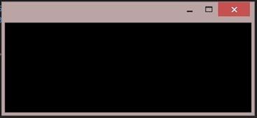
We have some starting point. Above style applied to an empty window results in something like this
The WindowChrome part (lines 4 to 9) is place where we can now modify what should be visible, how thick the borders should be and so on. In the Template part we had put so far the only mandatory control which is a content presenter so our window can display any content. We will modify it later. The most important now are the properties of WindowChrome class, so let me explain them.
CaptionHeight and ResizeBorderThickness defines the areas where we can drag and resize/move the window. Those areas are not visible, but placed on top of whole window. CaptionHeight defines the height of the top dragable bar which we use to move the window. ResizeBorderThickness defines the thickness of window border on which the mouse cursor switches into a a two side arrows and allows the user to resize window. Both those functionalities works as in every regular window. We don’t need to implement nothing here.
NonClientFrameEdges - by default the whole window rectangle is now available by the window template we define in our style. This includes window borders and header bar. Setting this property we can define which border should be excluded from the client area.
GlassFrameThickness and UseAreoCaptionButtons are related to each other. First defines how thick the standard glass frame should be visible. We can set it to 0 or even cover it with something else in the window template. We have here full flexibility. Note that changing the frame top thickness we change the height of the minimize, restore and close buttons. We can even make them invisible and we won’t be able to close our app. Using UseAreoCaptionButtons on the other hand we can make them disabled, for example if we want to use our own buttons. By the way, even if we set UseAreoCaptionButtons to false which makes the upper right corner buttons useless, they are still visible which is strange.
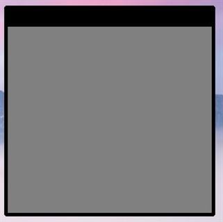
Ok, but our goal is to have a totally different look of the window border. We would like to have a 5 pixels thick black border on each side and the 30 pixels height header on top of the window. To achieve that we need to disable standard glass border and standard window buttons.
1: <WindowChrome CaptionHeight="30"
2: CornerRadius="4"
3: GlassFrameThickness="0"
4: NonClientFrameEdges="None"
5: ResizeBorderThickness="5"
6: UseAeroCaptionButtons="False" />
We also increased the corner radius so the frame is a little smoother. Next we need to draw the desired border in style template. We can use a border for that.
1: <Setter Property="BorderBrush" Value="Black" />
2: <Setter Property="Background" Value="Gray" />
3: <Setter Property="Template">
4: <Setter.Value>
5: <ControlTemplate TargetType="{x:Type Window}">
6: <Border Background="{TemplateBinding Background}"
7: BorderBrush="{TemplateBinding BorderBrush}"
8: BorderThickness="5,30,5,5">
9: <AdornerDecorator>
10: <ContentPresenter />
11: </AdornerDecorator>
12: </Border>
13: </ControlTemplate>
14: </Setter.Value>
15: </Setter>
Now our styled window looks like this
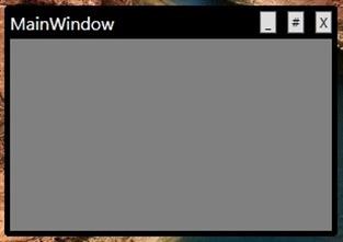
Great, but since we disabled glass border we have not buttons to minimize, restore and close window. This is the only thing we need to implement by our self, but fortunately this is not difficult. First we will add a three buttons to the window template which will provide the minimize, restore and close functionality. For the sake of simplicity we won’t style them, but of course you can adjust their look for your needs. Here is the final window style.
1: <Style x:Key="CustomWindowStyle" TargetType="{x:Type Window}">
2: <Setter Property="WindowChrome.WindowChrome">
3: <Setter.Value>
4: <WindowChrome CaptionHeight="30"
5: CornerRadius="4"
6: GlassFrameThickness="0"
7: NonClientFrameEdges="None"
8: ResizeBorderThickness="5"
9: UseAeroCaptionButtons="False" />
10: </Setter.Value>
11: </Setter>
12: <Setter Property="BorderBrush" Value="Black" />
13: <Setter Property="Background" Value="Gray" />
14: <Setter Property="Template">
15: <Setter.Value>
16: <ControlTemplate TargetType="{x:Type Window}">
17: <Grid>
18: <Border Background="{TemplateBinding Background}"
19: BorderBrush="{TemplateBinding BorderBrush}"
20: BorderThickness="5,30,5,5">
21: <AdornerDecorator>
22: <ContentPresenter />
23: </AdornerDecorator>
24: </Border>
25:
26:
27: <DockPanel Height="30"
28: VerticalAlignment="Top"
29: LastChildFill="False">
30:
31: <TextBlock Margin="5,0,0,0"
32: VerticalAlignment="Center"
33: DockPanel.Dock="Left"
34: FontSize="16"
35: Foreground="White"
36: Text="{TemplateBinding Title}" />
37:
38: <Button x:Name="btnClose"
39: Width="15"
40: Margin="5"
41: Click="CloseClick"
42: Content="X"
43: DockPanel.Dock="Right"
44: WindowChrome.IsHitTestVisibleInChrome="True" />
45:
46:
47: <Button x:Name="btnRestore"
48: Width="15"
49: Margin="5"
50: Click="MaximizeRestoreClick"
51: Content="#"
52: DockPanel.Dock="Right"
53: WindowChrome.IsHitTestVisibleInChrome="True" />
54:
55: <Button x:Name="btnMinimize"
56: Width="15"
57: Margin="5"
58: VerticalContentAlignment="Bottom"
59: Click="MinimizeClick"
60: Content="_"
61: DockPanel.Dock="Right"
62: WindowChrome.IsHitTestVisibleInChrome="True" />
63: </DockPanel>
64:
65: </Grid>
66:
67: </ControlTemplate>
68: </Setter.Value>
69: </Setter>
70: </Style>
We just added a dock panel on top of the window frame with right side buttons and left side window title. One important note: the attached property set on every button
WindowChrome.IsHitTestVisibleInChrome=”True”
allows the buttons to be clickable. This is because the draggable header area, which is used to move the window frame and covers our dock panel, takes the mouse hits first causing underneath buttons to be disabled.
Last thing we need to do is to implement the Click methods for each of the right upper corner buttons. We can do it in a code behind class of the source dictionary containing our window style. So we add a new code file and name it WindowStyle.xaml.cs so the Visual Studio would treat it as a code behind fie for the resource file. Inside this file we add following class
1: using System;
2: using System.Collections.Generic;
3: using System.Linq;
4: using System.Text;
5: using System.Threading.Tasks;
6: using System.Windows;
7:
8: namespace WpfApplication
9: {
10: public partial class WindowStyle : ResourceDictionary
11: {
12: public WindowStyle()
13: {
14: InitializeComponent();
15: }
16: }
17: }
And in xaml file we add a class definition in the file header
1: <ResourceDictionary x:Class="WpfApplication.WindowStyle"
2: xmlns="http://schemas.microsoft.com/winfx/2006/xaml/presentation"
3: xmlns:x="http://schemas.microsoft.com/winfx/2006/xaml">
4: ...
Now we can simply add a implementation of CloseClick, MaximizeRestoreClick, and MinimizeClick methods.
1: public partial class WindowStyle : ResourceDictionary
2: {
3: public WindowStyle()
4: {
5: InitializeComponent();
6: }
7:
8: private void CloseClick(object sender, RoutedEventArgs e)
9: {
10: var window = (Window)((FrameworkElement)sender).TemplatedParent;
11: window.Close();
12: }
13:
14: private void MaximizeRestoreClick(object sender, RoutedEventArgs e)
15: {
16: var window = (Window)((FrameworkElement)sender).TemplatedParent;
17: if (window.WindowState == System.Windows.WindowState.Normal)
18: window.WindowState = System.Windows.WindowState.Maximized;
19: else
20: window.WindowState = System.Windows.WindowState.Normal;
21: }
22:
23: private void MinimizeClick(object sender, RoutedEventArgs e)
24: {
25: var window = (Window)((FrameworkElement)sender).TemplatedParent;
26: window.WindowState = System.Windows.WindowState.Minimized;
27: }
28: }
One note: since the resource dictionary class does not have a context of styled window we must extract it each time from the clicked button, but this is easy
1: var window = (Window)((FrameworkElement)sender).TemplatedParent;
Our styled window now looks like this
And that’s it. We have a solid starting point to create totally customized fancy window frames ![]()
The style with code behind is available in attachement.

 back
back


cs
11/12/2014 10:16 AM
Hi, Thank you for the great post. I am having some difficulty in making your example work. Could you please provide your full sample project, so I could see how you are applying the style to the Window. Thank you, CSAlex
9/11/2015 9:40 AM
Clear and simple! Great job! Thanks!Pedro Júnior
8/15/2016 7:16 PM
The best, simple and practical tutorial I've ever seen .Lukas
10/24/2016 9:26 AM
Hey Mirek, this is very usefull. Thanks alot!jors
8/21/2017 5:35 PM
Hi, Thank you. It worked all fine except that the menu in xaml of the main windows is only responsive to keyboard, but not to mouse click. When I don't set the resource, menu is active again with mouse. How can I recover the access to my menu with the mouse by using this windows restyling?Mangesh
11/14/2017 1:01 PM
Great tutorial! Very easy than changing the default window styles! This saved me. Thanks!Kevin Kouketsu
9/25/2018 9:58 PM
I don't know if you are using this blog yet but I want to thank you for the great post. But Im having a problem. When the window is maximized, some informations of screen are get out of screen. Like close button, title caption and same with bottom of application. When I active a Full screen mode (I made this code) everything works fine 'cause the title bar is hidden. Do you have a solution to problem with Maximized mode? ThanksETCanway
5/30/2019 10:42 PM
Thank you so much!