Simple, bindable PieChart in WPF
By Mirek on (tags: itemscontrol, Pie Chart, WPF, categories: code)Today I will show you a simple way to have a pie chart in your WPF application with use of ItemsControl. The pieces of the pie will be binded to the undergoing item model collection. Let’s take a look at it.
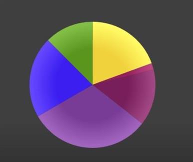
The goal is to achieve a pie chart presented on the picture below, having just a collection of items.
Each item should be an object with following properties
1: public class PiePiece
2: {
3: public string Name { get; set; }
4:
5: public Color Color { get; set; }
6:
7: public int StartAngle { get; set; }
8:
9: public int EndAngle { get; set; }
10: }
The pie chart is constructed as a ItemsControl with specified ItemTemplate
1: <ItemsControl Width="250"
2: Height="250"
3: ItemsSource="{Binding PiePieces}">
4: <ItemsControl.ItemsPanel>
5: <ItemsPanelTemplate>
6: <Grid IsItemsHost="True" />
7: </ItemsPanelTemplate>
8: </ItemsControl.ItemsPanel>
9: <ItemsControl.ItemTemplate>
10: <DataTemplate>
11: <ed:Arc Width="250"
12: Height="250"
13: ArcThickness="1"
14: ArcThicknessUnit="Percent"
15: EndAngle="{Binding EndAngle}"
16: StartAngle="{Binding StartAngle}"
17: Stretch="None"
18: ToolTip="{Binding Name}">
19: <ed:Arc.Fill>
20: <RadialGradientBrush Center="125,125" GradientOrigin="125,125"
21: MappingMode="Absolute" RadiusX="120" RadiusY="120">
22: <GradientStop Offset="0.0" Color="{Binding Color}" />
23: <GradientStop Offset="0.6" Color="{Binding Color}" />
24: <GradientStop Offset="1" Color="{Binding Color,
25: Converter={StaticResource ColorLighterConverter}}" />
26: </RadialGradientBrush>
27: </ed:Arc.Fill>
28: </ed:Arc>
29: </DataTemplate>
30: </ItemsControl.ItemTemplate>
31: </ItemsControl>
As you can see the panel for the items is Grid and each item is just an Arc drawn within this grid. Pie pieces are drawn one by one with angle offset. The start and end angle of each piece has to be computed on the undergoing collection. Pie pieces ale colored with radial gradient centered in the middle of the grid. The gradient is constructed by making the provided color a little bit lighter with use of ColorLighterConverter.
Important note: the Arc shape is defined in following namespace
in Microsoft.Expression.Drawing.dll library from Microsoft Expression Blend SDK.
That’s it
Cheers

 back
back
