WPF– visual states in MvvM
By Mirek on (tags: behaviors, Expression Blend, Visual state, WPF, categories: code)WPF has many rich features which facilitates making a great look&feel of the application. Unfortunately many of those features are cumbersome to implement and use when we develop in a Model - View – ViewModel architecture. In this post I will try to make you more familiar with visual states and how can we use them in our MvvM application.
Visual state simply defines a state of a control (or more precisely a visual element) by defining its properties values. Additionally in visual states groups we can define a transitions (animations) that are to be performed when switching from one state to another. With use of VisualStateManager we can switch the state of a control from the code behind.
We can define visual states of our control in the XAML or with use of Expression Blend designer. I recommend to use the second option because it speeds up the work rapidly in this case.
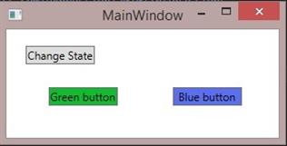
Let assume for the sake of simplicity we have a simple window with three buttons. On button will be used to change the state of the window by binding to the attached view model property. The window will have two visual states. In one there will be green button visible and in the second there will be blue button visible. We want to make the transition between visual states to be triggered from the view model. 
For the sake of simplicity we will use the window’s code behind class as ViewModel (which is of course not ok with MvvM pattern but makes no difference from the view perspective).
1: public partial class MainWindow : Window, INotifyPropertyChanged
2: {
3: public event PropertyChangedEventHandler PropertyChanged;
4:
5: private bool StateSwitchVar;
6: public bool StateSwitch
7: {
8: get { return StateSwitchVar; }
9: set
10: {
11: StateSwitchVar = value;
12: if (PropertyChanged != null)
13: PropertyChanged(this, new PropertyChangedEventArgs("StateSwitch"));
14: }
15: }
16:
17: public MainWindow()
18: {
19: InitializeComponent();
20: StateSwitch = false;
21: }
22: }
StateSwitch is the property which we want to control the visual state of our application. In XAML we need to set the DataContext of the view and add a binding to the switch button.
1: <Window x:Class="WpfApplication1.MainWindow"
2: xmlns="http://schemas.microsoft.com/winfx/2006/xaml/presentation"
3: xmlns:x="http://schemas.microsoft.com/winfx/2006/xaml"
4: x:Name="window">
5:
6: <Grid DataContext="{Binding ElementName=window}">
7: <ToggleButton x:Name="checkBox"
8: Margin="21,18,0,0"
9: HorizontalAlignment="Left"
10: VerticalAlignment="Top"
11: Content="Change State"
12: IsChecked="{Binding StateSwitch, Mode=TwoWay}" />
13: <Button x:Name="greenButton"
14: Width="75"
15: Margin="45.5,63,0,0"
16: HorizontalAlignment="Left"
17: VerticalAlignment="Top"
18: Background="#FF14B932"
19: Content="Green button" />
20: <Button x:Name="blueButton"
21: Width="75"
22: Margin="180.5,63,0,0"
23: HorizontalAlignment="Left"
24: VerticalAlignment="Top"
25: Background="#FF5B6FEE"
26: Content="Blue button" />
27: </Grid>
28: </Window>
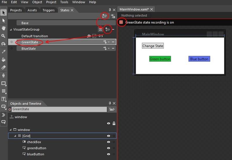
Ok Now we are ready to define visual states in the application. In Expression Blend select “States” tab and add visual states group and two visual states. Name one GreenState and the second BlueState.
Note that when you select a visual state, the designer area is marked with red rectangle and the green state recording is on. It mean that any change to the visual elements on the view is registered for current visual state. Ok, then if in GreenState we want only green button be visible let’s make blue button collapsed here. The same for BlueState.Click on BlueState to make it recording on (both buttons should be visible now) and make green button collapsed this time.
Additionally you can set the Opacity of the button to 0% when it is collapsed. This will allows us to animate the button visibility transition.
Set 1 second in “Default transition”. This will generate a default animation when switching visual state from any state to any state. Visibility of the button cannot be animated because it is of a enumeration (discrete) type, but the opacity is a double number and this parameter is considered when we add a transition animation.
1: <DoubleAnimationUsingKeyFrames Storyboard.TargetProperty="(UIElement.Opacity)" Storyboard.TargetName="blueButton">
2: <EasingDoubleKeyFrame KeyTime="0" Value="0"/>
3: </DoubleAnimationUsingKeyFrames>
Expression Blend has yet one great feature here. In the upper right corner of the “States” tab you have a button with arrow and a little play symbol. This enables the visual states transitions preview mode. When you click it the transitions will be animated in the designer anytime you change the state selection.
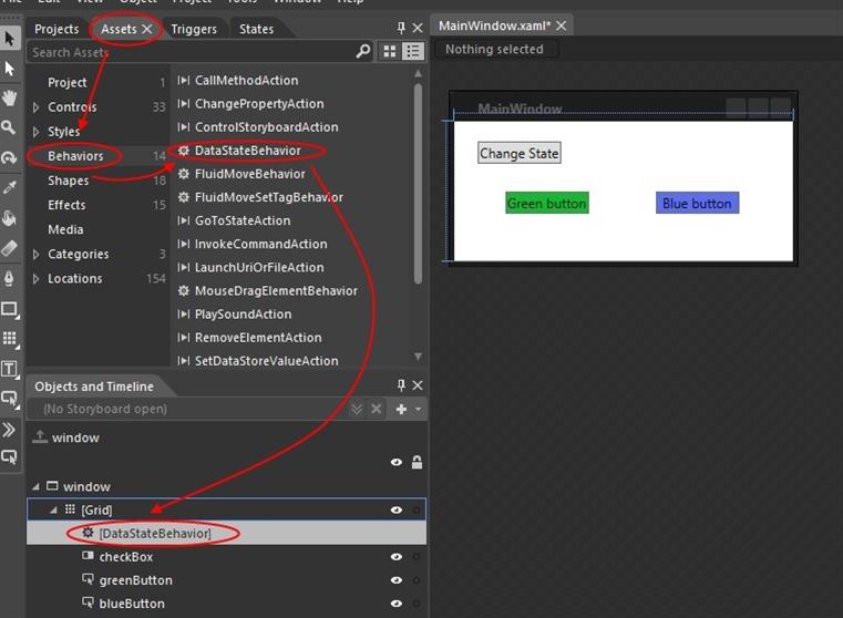
Ok we have visual states defined, but how can we change the current state of our view. Here the behaviors and the triggers come in help. We can choose from existing behaviors and triggers or write the custom one. For this example need we will use the existing one. Go to “Assets” tab and in “Behaviors” section find DataStateBehavior. Drag it down and drop somewhere inside the window.
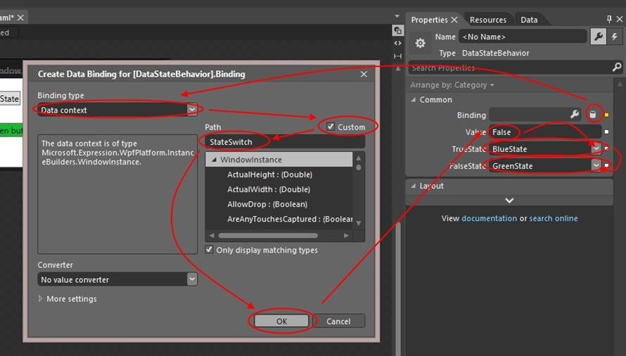
Now with the behavior selected go to “Properties” tab and define the binding as displayed below. This behavior simple will set the BlueState when the value of SwitchState is false and GreenState when it is true.
All those operations results in following XAML
1: <i:Interaction.Behaviors>
2: <ei:DataStateBehavior Binding="{Binding StateSwitch}" Value="False" TrueState="BlueState" FalseState="GreenState"/>
3: </i:Interaction.Behaviors>
If our application would have more that two states we would probably use triggers and GoToStateAction which in this case would look like this:
1: <i:Interaction.Triggers>
2: <ei:DataTrigger Binding="{Binding StateSwitch}" Value="False">
3: <ei:GoToStateAction StateName="BlueState"/>
4: </ei:DataTrigger>
5: <ei:DataTrigger Binding="{Binding StateSwitch}" Value="True">
6: <ei:GoToStateAction StateName="GreenState"/>
7: </ei:DataTrigger>
8: </i:Interaction.Triggers>
Cheers

 back
back


