Sticky floating sidebar with pure CSS
By Mirek on (tags: css, flex, HTML, sidebar, sticky, categories: code, web)In this short post I will show you how to make a floating but sticky elements on a side bar. The element is sticky to the bottom of the screen, but when content is scrolled then the upcoming header or footer element gets precedense and moves the sticky element around. See how it behaves on an animation.
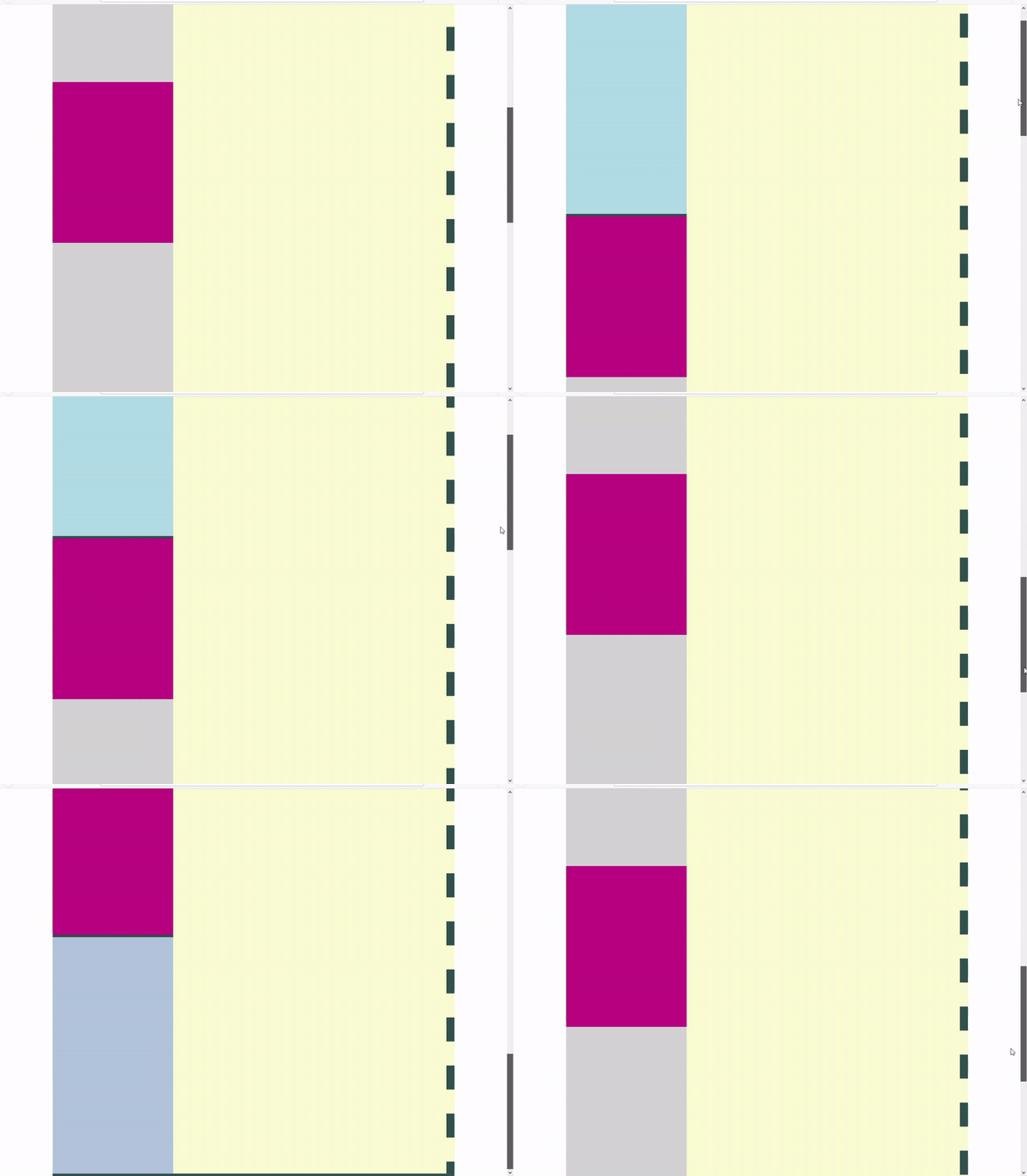
To have an idea about the challenge we are going to solve, take a look at following animation (Click on it !):
The picture above presents a skeleton of a basic web page layout. We have main content on the right – yellow color. As you can see the content can be scrolled. On the left column we have header on the top and the footer on the bottom. Both of them becomes visible when content is scrolled up or down. At the same time we have the sticky element which is glued to the center of the left column, but does not overlay neither header nor footer.
So the html can be defined as simple as following structure
<body>
 <div class="center">
  <div class="left">
   <div class="header"></div>
   <div class="flyer"></div>
   <div class="footer"></div>
  </div>
  <div class="right"></div>
 </div>
</body>
The trick is to use the css sticky property on the flyer class element. But to make it working correctly the element need a space to slide in. We need to add another container around the flyer. Lets call it flyer-track.
<body>
 <div class="center">
  <div class="left">
   <div class="header"></div>
   <div class="flyer-track">
   <div class="flyer"></div>
  </div>
  <div class="footer"></div>
 </div>
 <div class="right"></div>
</div>
</body>
Next we must assure the flyer-track gets the whole available spece between the header and footer. To acomplish that I use flex to layout items inside the left container
.left{
  [...]
  display: flex;
  flex-flow: column nowrap;
  justify-content: space-between;
}
and make the track grow to fill all available space
.flyer-track{
  flex: 1 0 auto;
}
Then we can simply make the flyer sticky and position it vertically
.flyer{
  position: sticky;
  top: 20vh;
}
Thats it. Whole code: html + css is attached to this post. Enjoy!

 back
back

Caio
5/10/2019 7:44 PM
Thank you very much about the explanation. On my opnion u should remove all this unecessery content from this example site. Just do something with less css code, as your explanation! I Was searching it about 3 days, thaaank you!